The client was the Singapore Paediatric Society. It is the lead professional body for child health experts, driving medical research and expert guidance for doctors and parents since 1952.
The client stated that the organiser wanted a logo design for the event. The logo had to be representative of paediatrics and not appear too corporate. Once approved, the materials should be aligned to the theme and logo design.
Noting the nature of paediatrics, I explored early childhood themes such as the mannerisms or the type of toys. I then designed a logo with 3 different stages of growth: Newborn, Infancy, and Toddlerhood. I also added colors that were widely used in paediatric healthcare and education to relate with the professionals.
Task highlights:
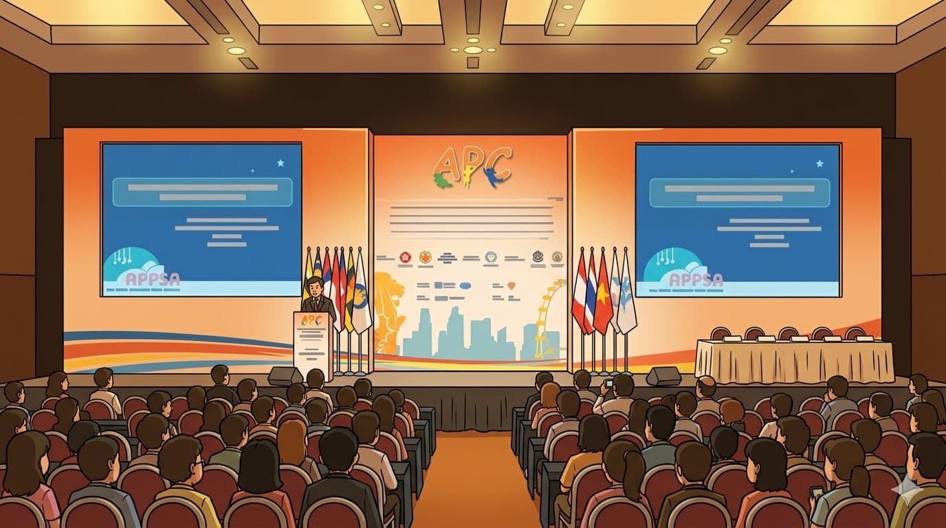
The project was successfully delivered to the client for their use, including copyrights to the artwork and content.
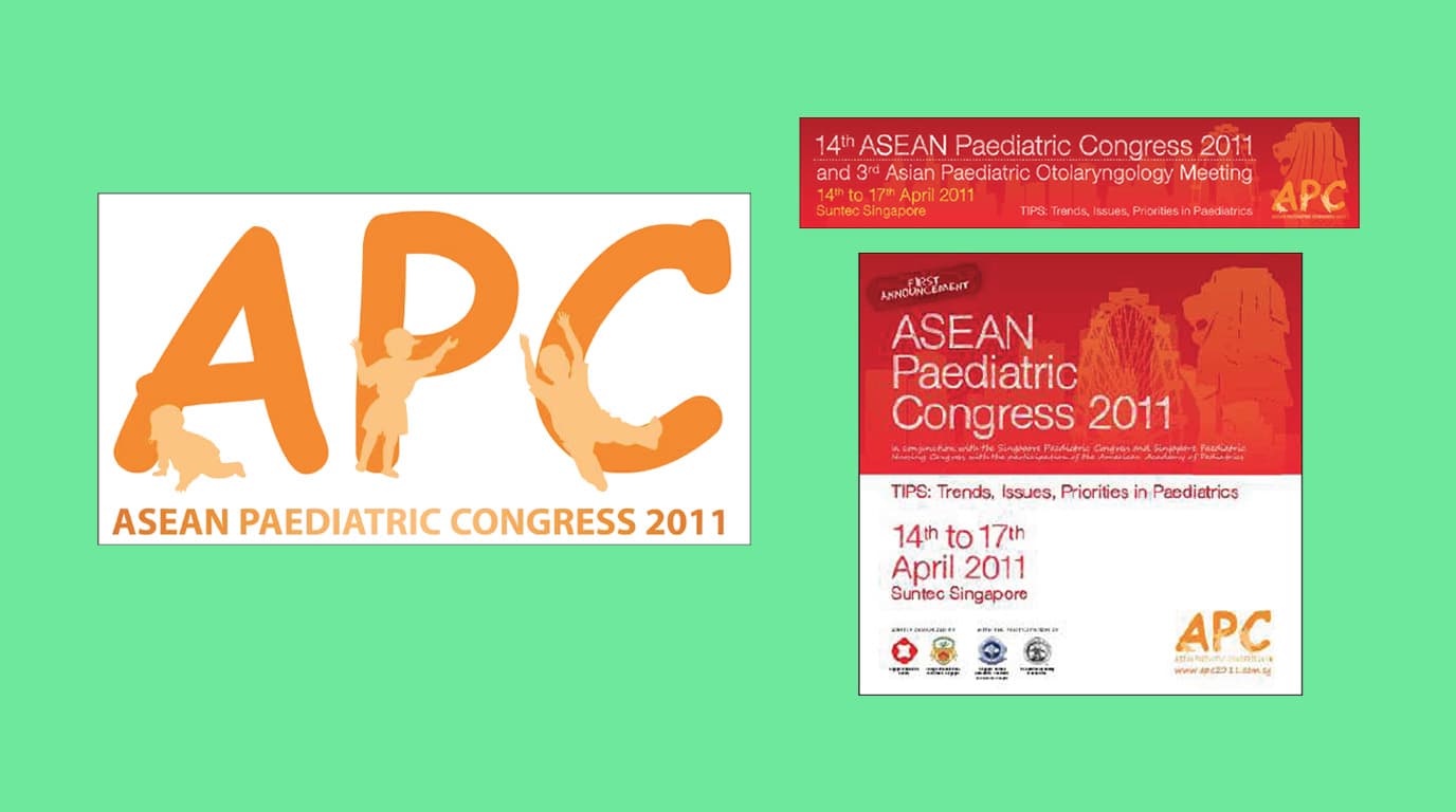
Logo designed
Adaptations
Revisions

Digital Ops
Rebuilding a shop's customer base after relocation. Here's how I did it with a new website and paid search.

Digital Ops
Running back-to-back campaigns and tactical projects. This is a snapshot of my daily work.

Campaigns
An overview of the two-phase funnel campaign developed to generate leads for wealth management solutions.
© 2026 All Rights Reserved.